From the Vault to the ‘Gram: Our POS story (then and now) as told through our love of art.
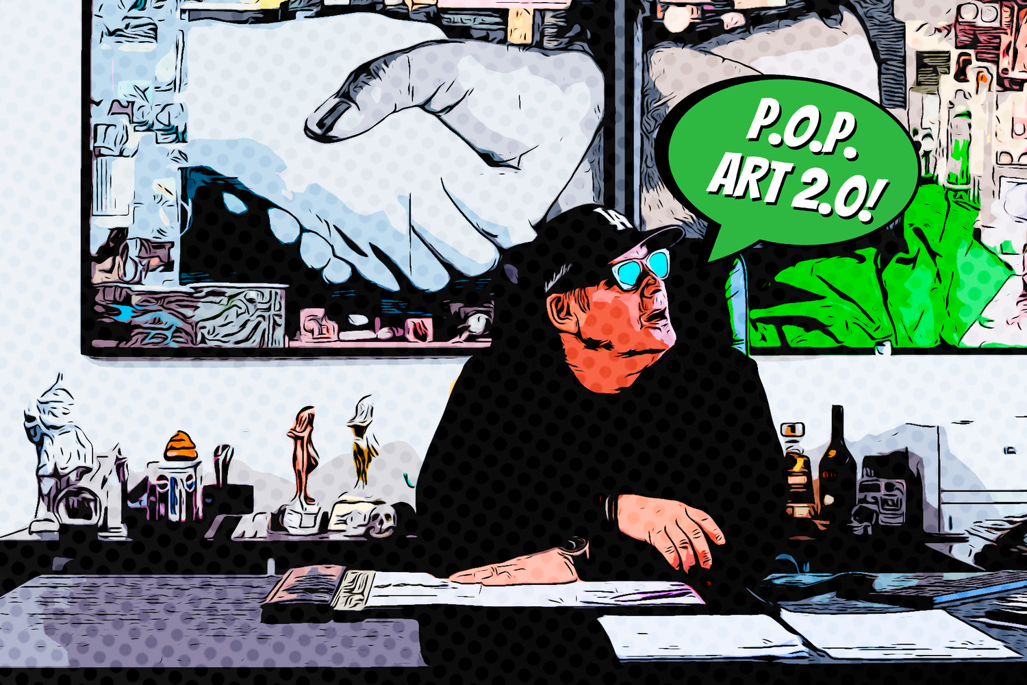
We recently dug into the Proprint Archives and stumbled upon this gem – P.O.P art – a Point of Purchase capability catalogue visualized in pop art, comic book aesthetic.


P.O.P art is a retro piece that not only showcased our creative structural design ideas on paper, but became a jumping off point to translate our POP/POS offering digitally through our first pop-online blog – which has since been reinvented here, on our Proprint 2.0 blog and social channels.
Our little trip down nostalgic lane motivates us to tell our continuous growth story. From Proprint 2.0 to P.O.P Art 2.0, we’re tapping into our love of pop art to highlight our POS evolution and the brands that support us along the way!

Taking cues from pop art’s visual language; our use of bold colours and eye for innovative printing techniques all informs our strategic partnership work with clients. We work alongside our client’s marketing, advertising, and design teams to help transform CPG products into experienced-driven works of art. From packaging design to retail POP/POS displays, design sparks a dialogue between a brand and the consumer – and we love being in the mix!
With a peek into our artistic side, you’ll notice that art is everywhere at Proprint. From our offices to our sketches, we surround ourselves with inspiration to help feed our creativity, inspire us to continuously evolve, and push us to reimagine what’s possible – for ourselves and our clients.
Keep Kickin’ It Old School,

P.S. Stay tuned on the ‘gram, Facebook, and LinkedIn as we keep it old school with blast from the past retro posts featuring POS, people, and equipment from the Proprint Archives!
